
This was going to be my most ambitious design for the Jazz Residency. Based upon the themes provided to the the musicians, and subsequently passed on to me, a concept was born. The years' theme was all connected to neighborhoods and togetherness. For the concept, I drew upon Philadelphia's row home style architecture and decide to throw a house party. The skyline and other hints of some other city features, including a power line with shoes hanging from it, a chimney, a directTV satellite, etc. - something that leans into a Philly neighborhood.
Philadelphia is also known as the “Mural Capital of the World,” with over 4,000 murals created in the city, so I used that as the way of illustrating the musicians quotes about their personal journey and their reactions to the residency. Alas....Covid hit and stopped the world and this project in its tracks...

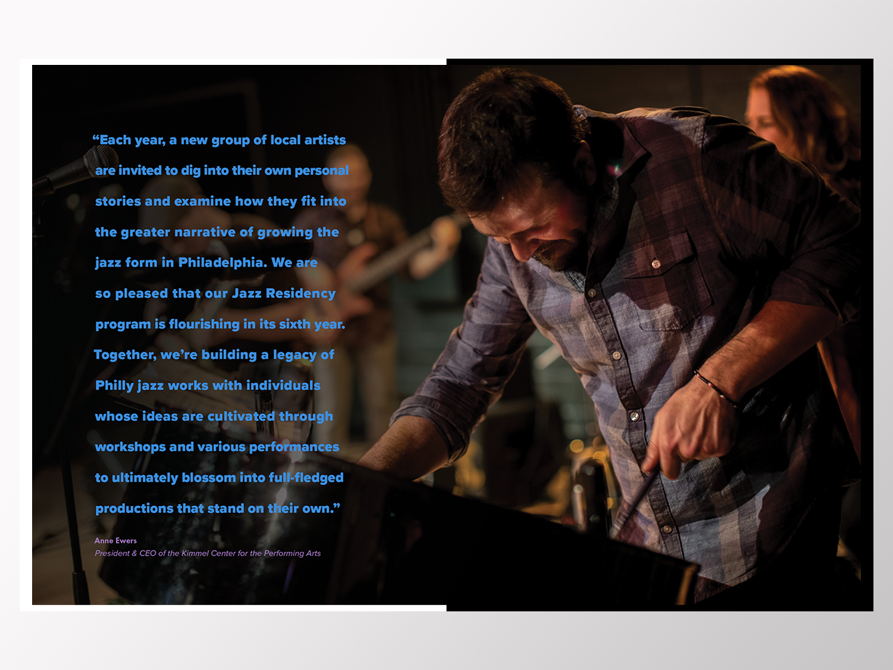


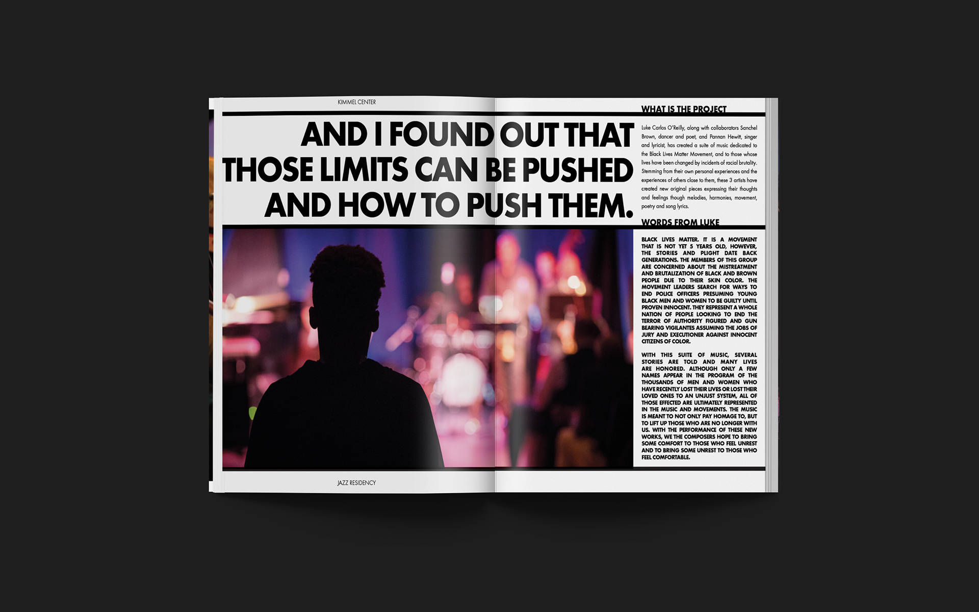
The Kimmel Center (now known as Ensemble Arts) has committed to developing the future of Jazz in Philadelphia though innovative forms, socially relevant projects, and powerfully rich music. This years theme was centered around topics that are important to the people and neighborhoods of our city; the Black Lives Matter Movement, gentrification and to those whose lives have been changed by incidents of racial brutality. With this suite of music, several stories are told and many lives are honored. The residency composed a musical portrait of the cultures, peoples, faith groups, and events that make this corridor important and unique to Philadelphians.
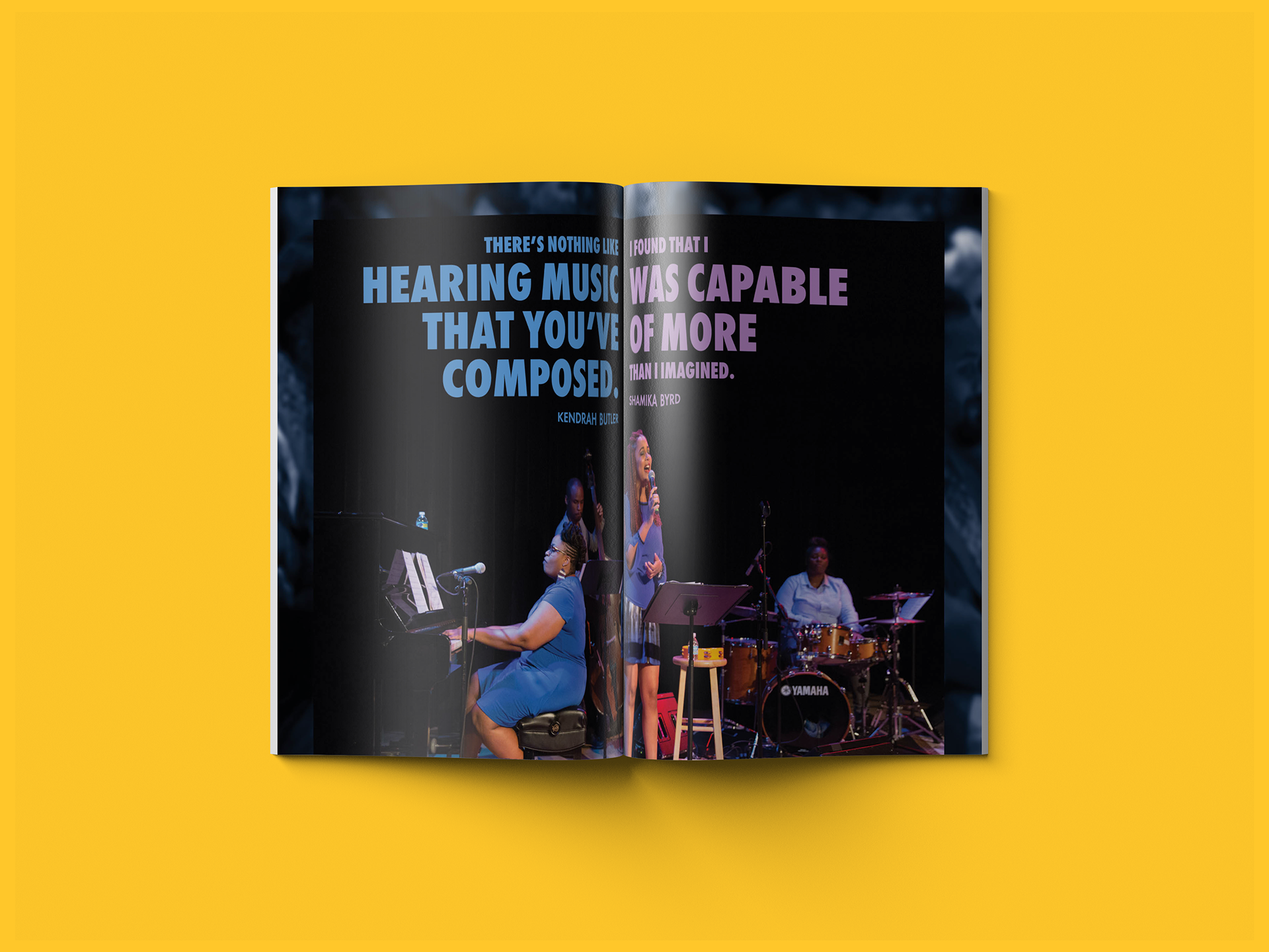
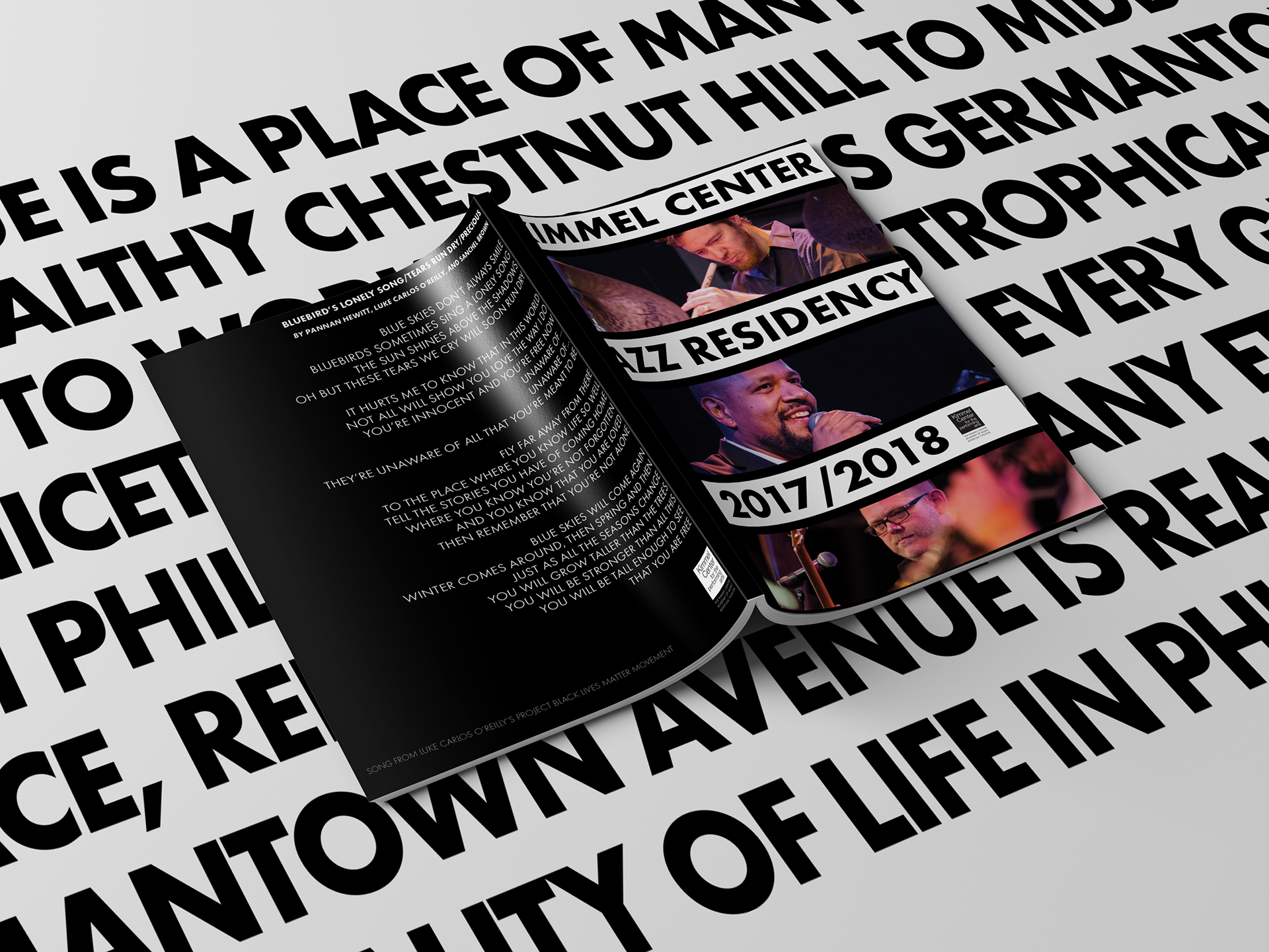
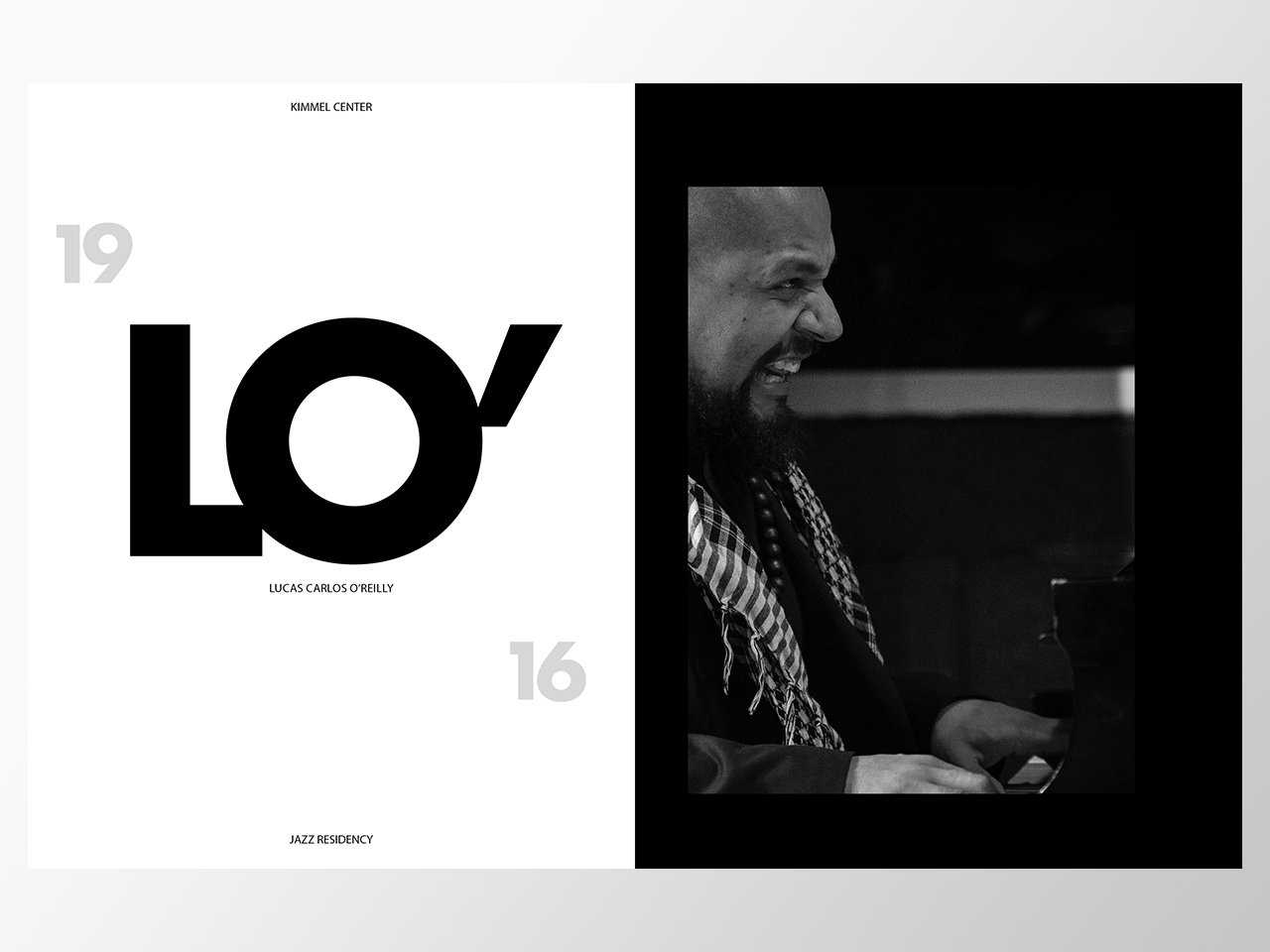
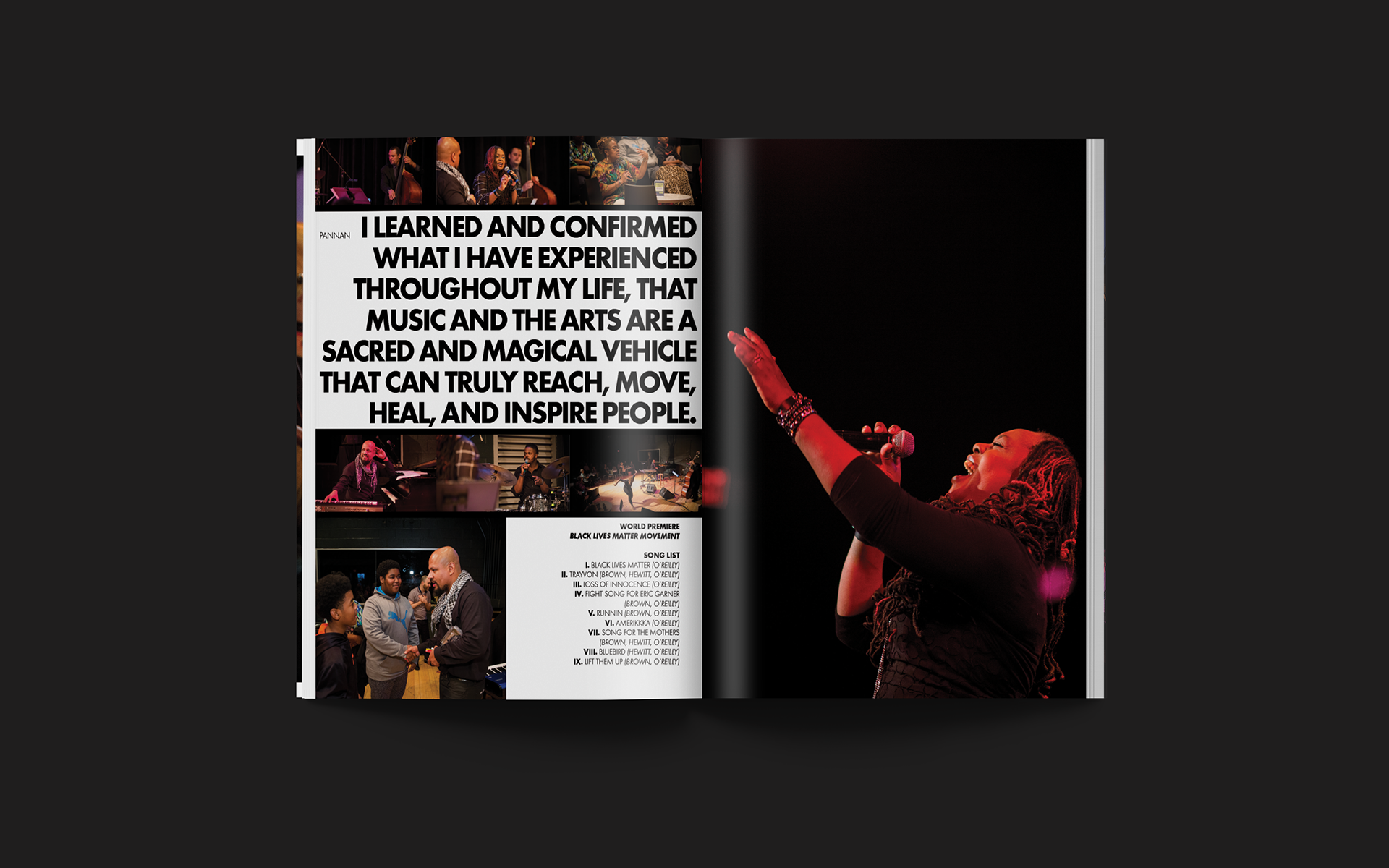
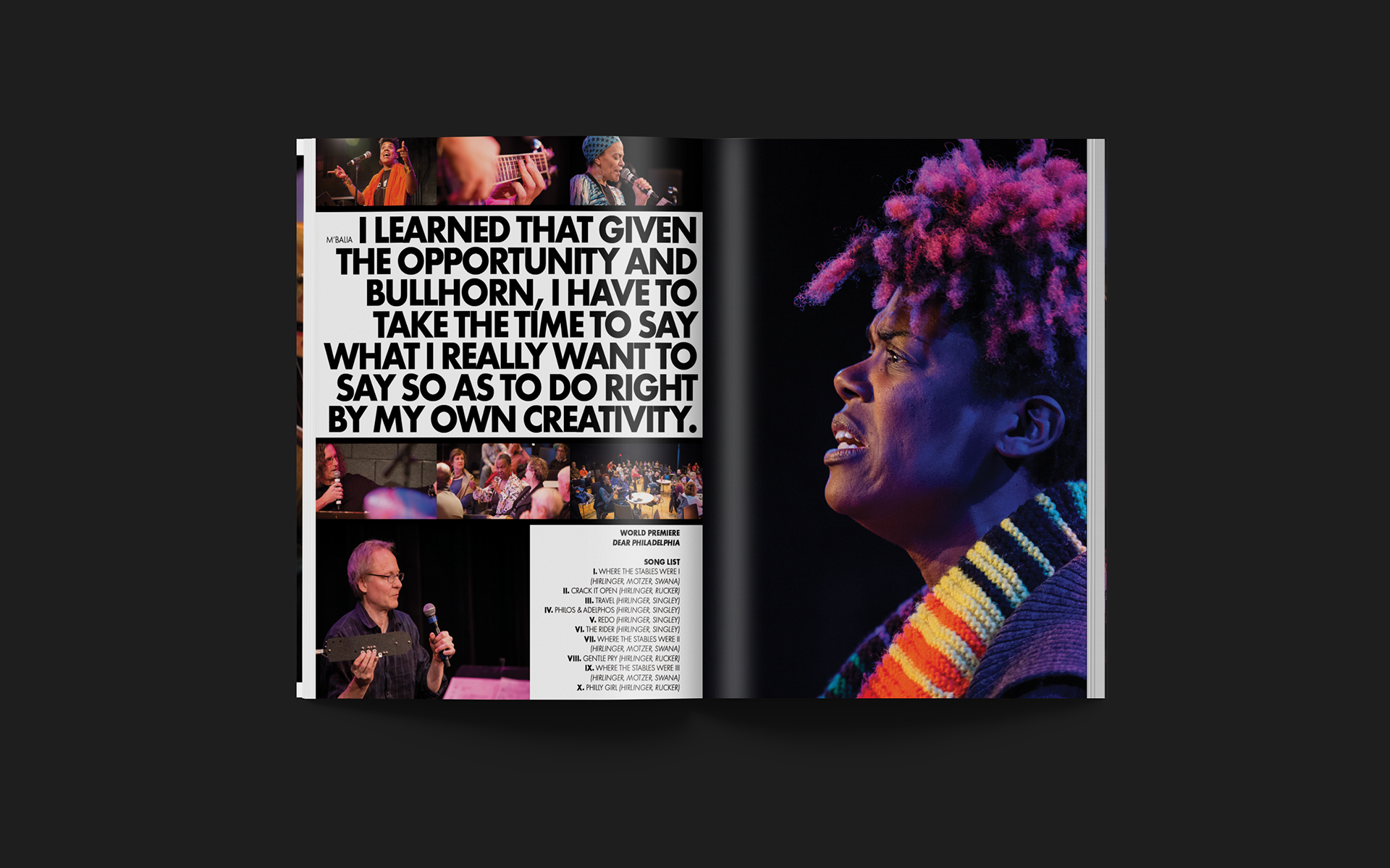
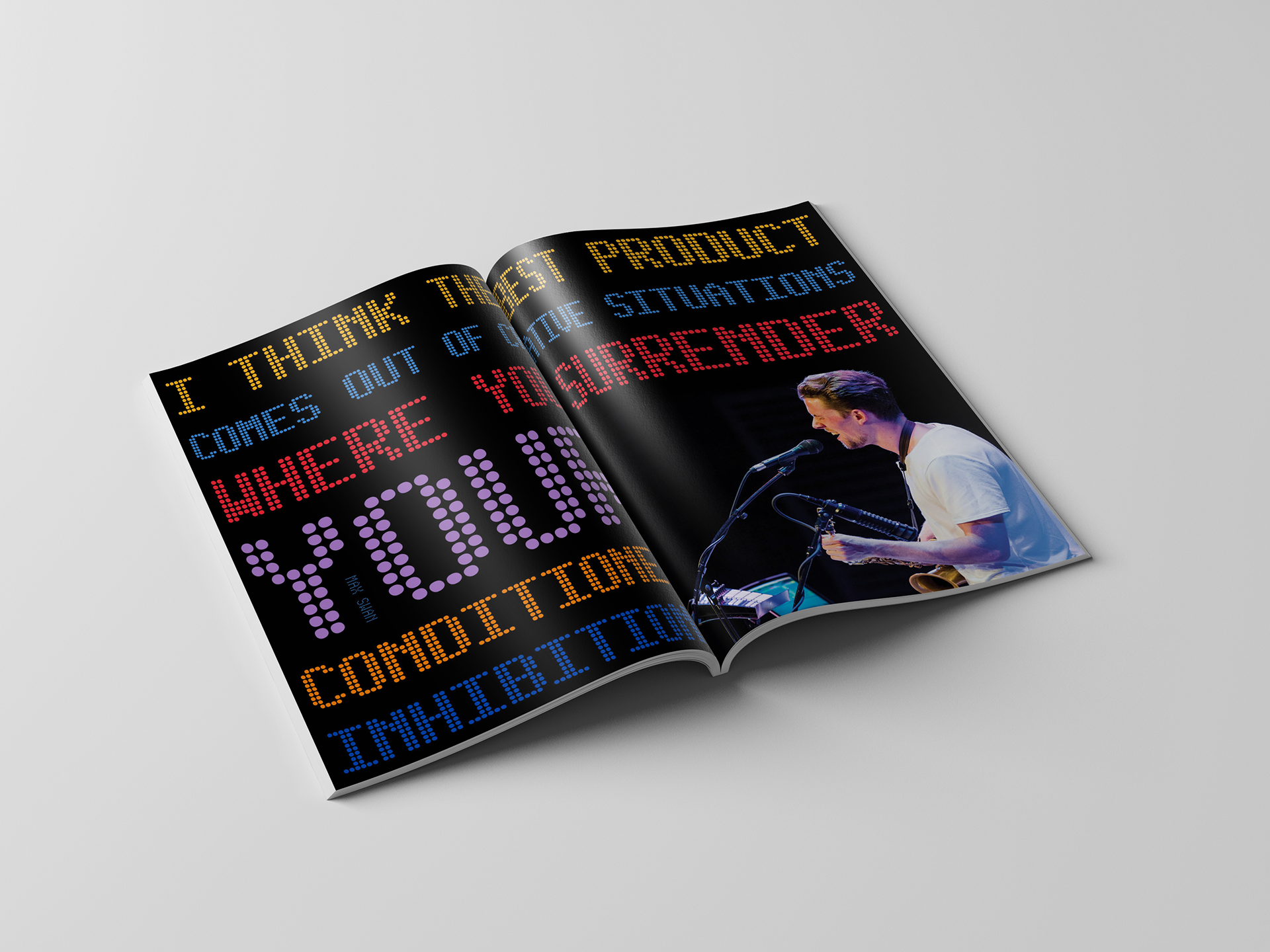
To illustrate the concept, I pared the design down to two colors, Black and White, used all caps to give a harsh and aggressive institutional feel and used black bars to give the feeling of tension and confinement. To contrast the claustrophobic feeling, I made sure, on the inside spreads, to never have any words completely surrounded on all four sides. There is always space for the words to escape and no matter what happens, voices will be heard. To reinforce this feeling of "This is what I have to say!," I primarily selected images with bright colors and did my best to focus on the intense and expressive faces of the artists imparting concern, mistreatment, but also hope...


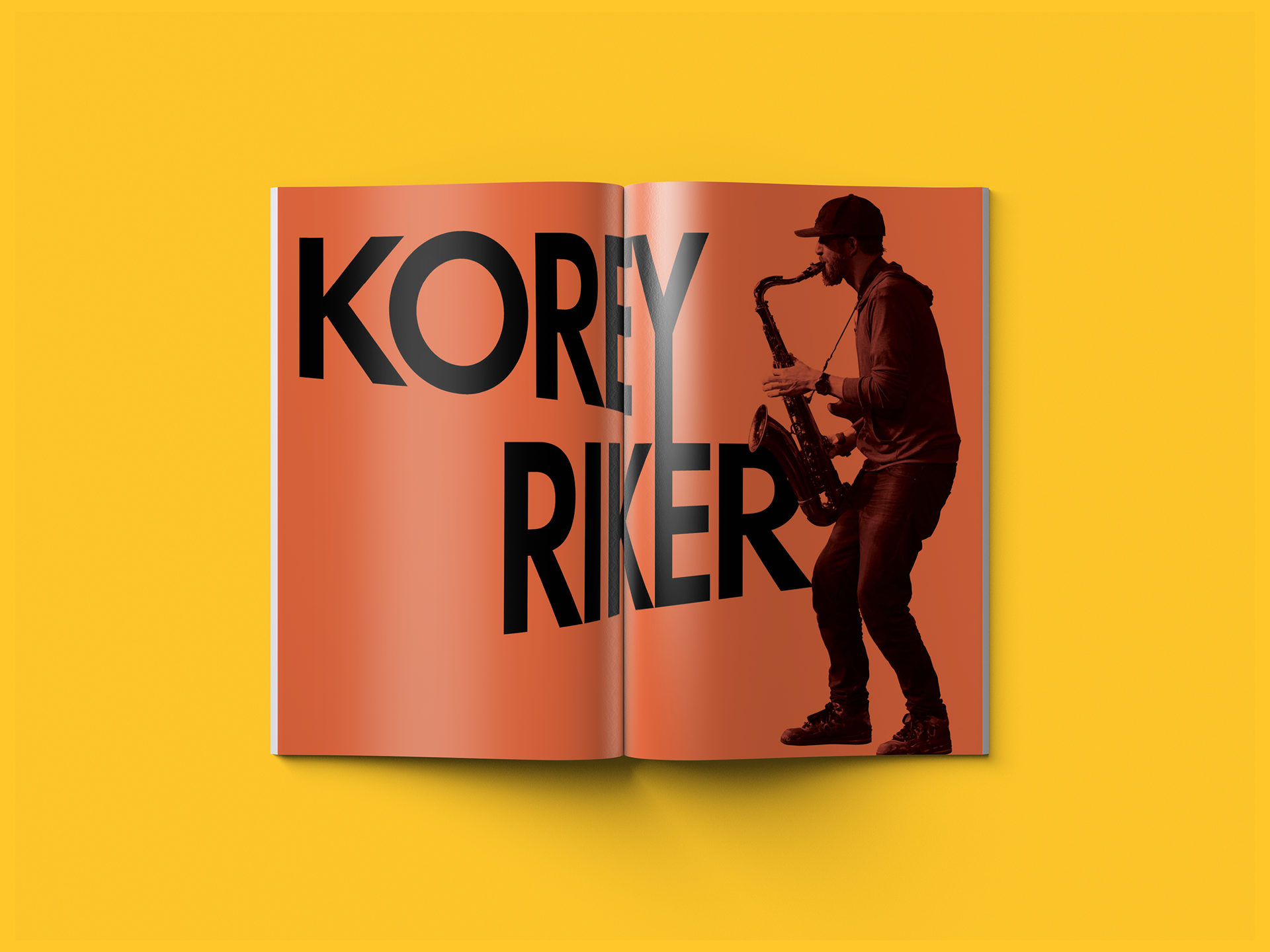
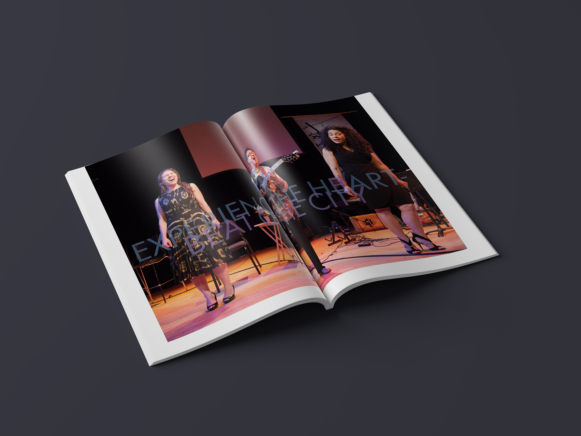
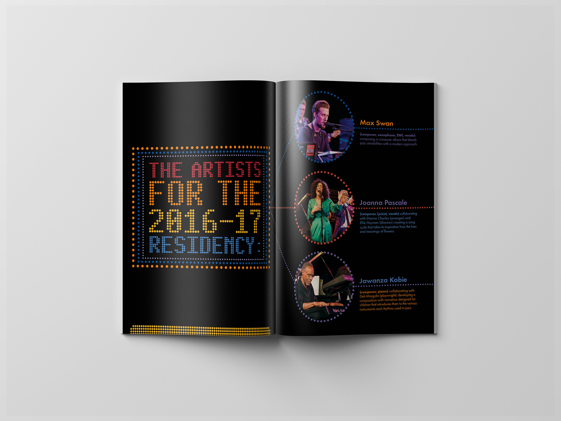
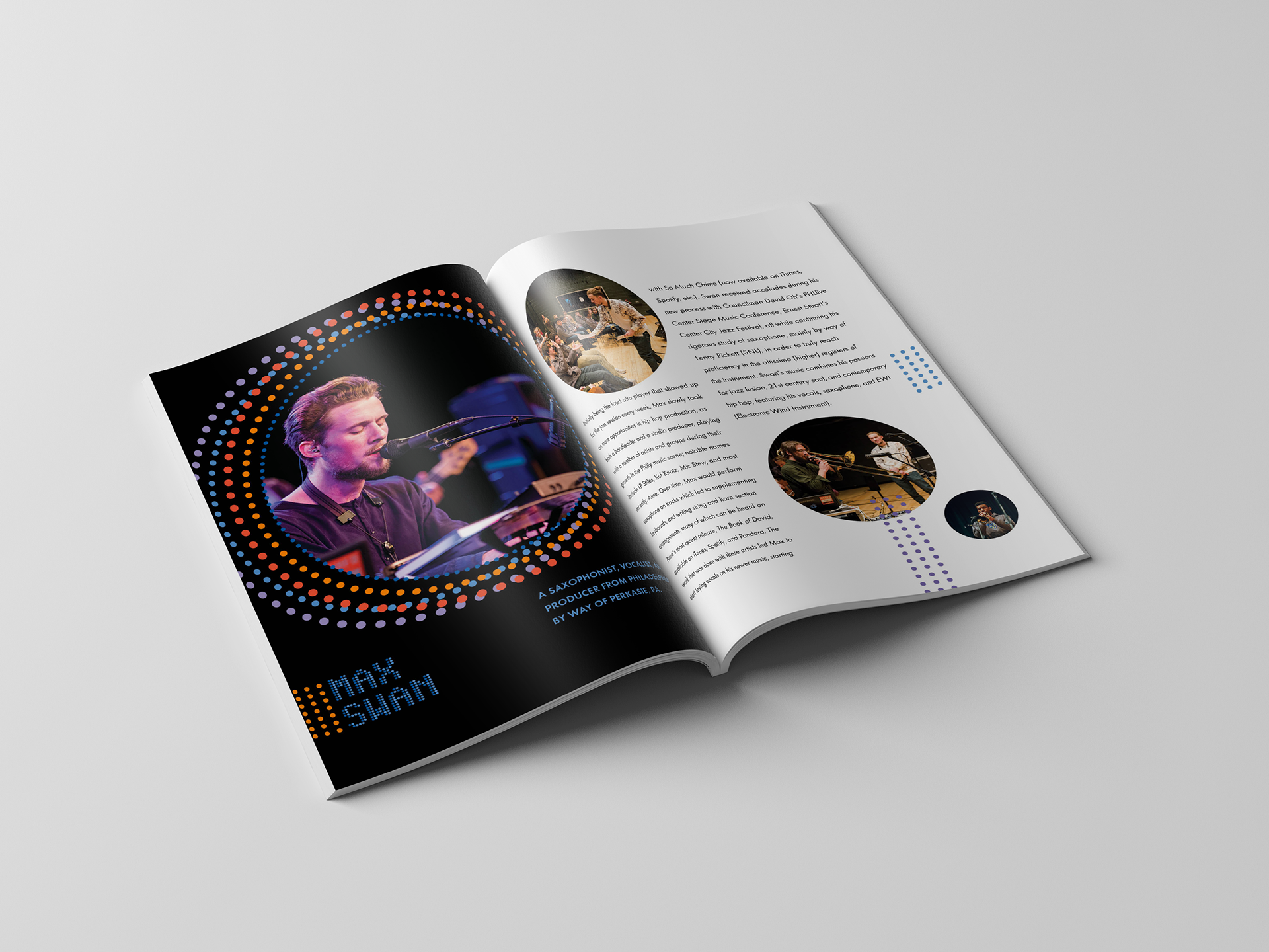
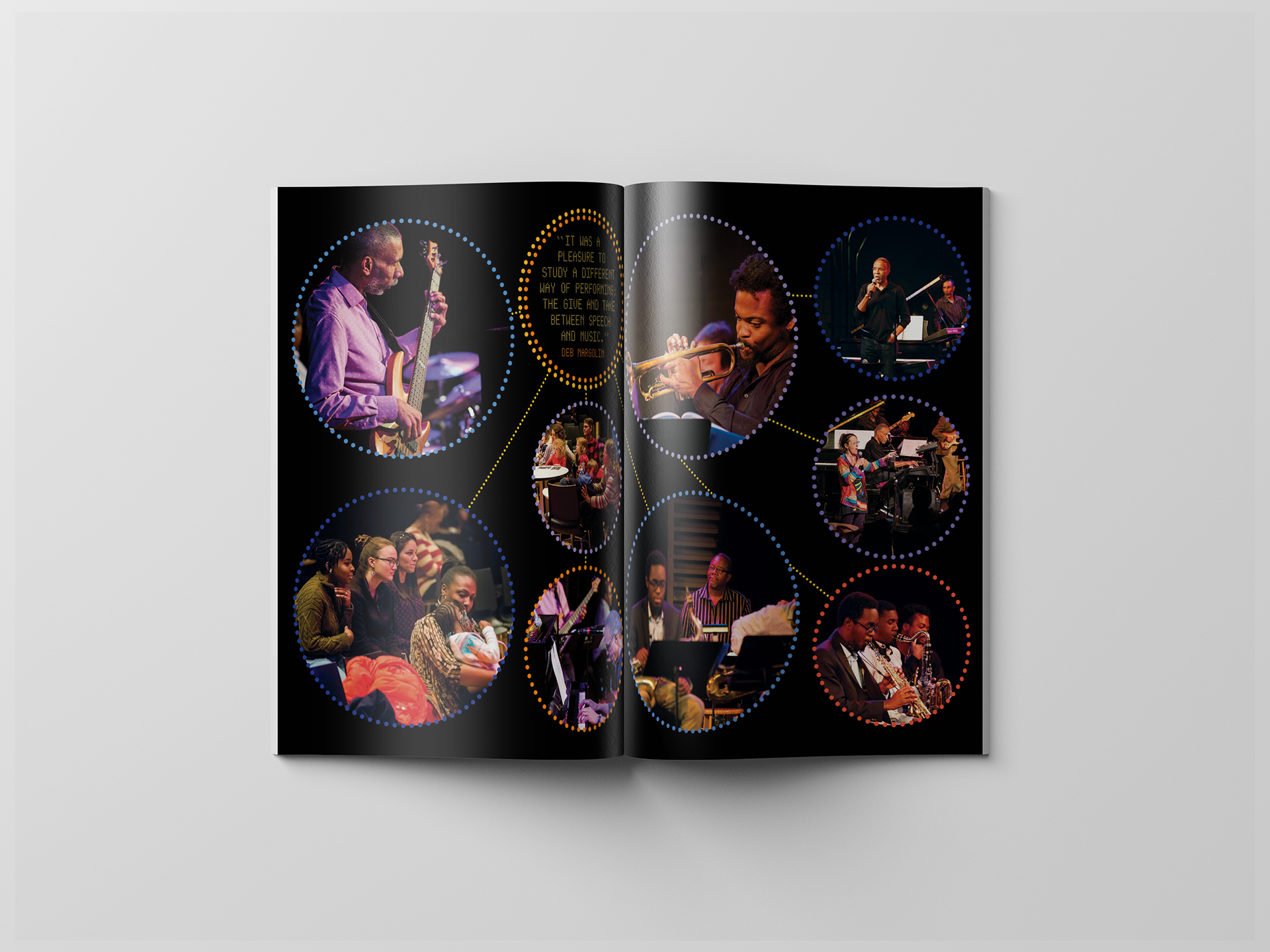
For this years brochure, I took the design in a bright lights, big city direction. All I could think of where those theater marquees from old movies and wanted to have the same excitement and energy, but in a more subtle and intimate way. What I wanted to accomplish was to complement the photography, and not obscure it, by leaving plenty of negative space and breathing room. Using rhythm and repetition gives the design a sense of motion and gives a platform for each musician and their bandmates to be portrayed as the stars they are.


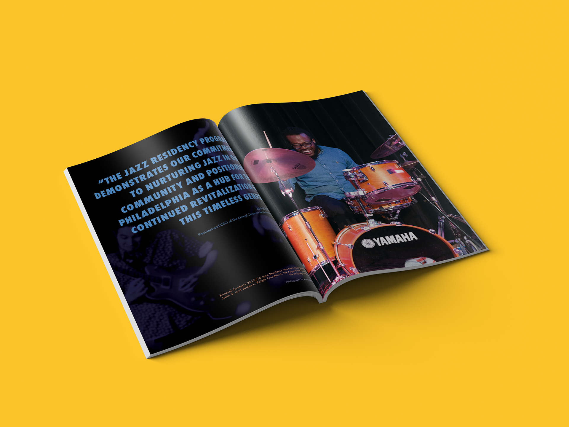
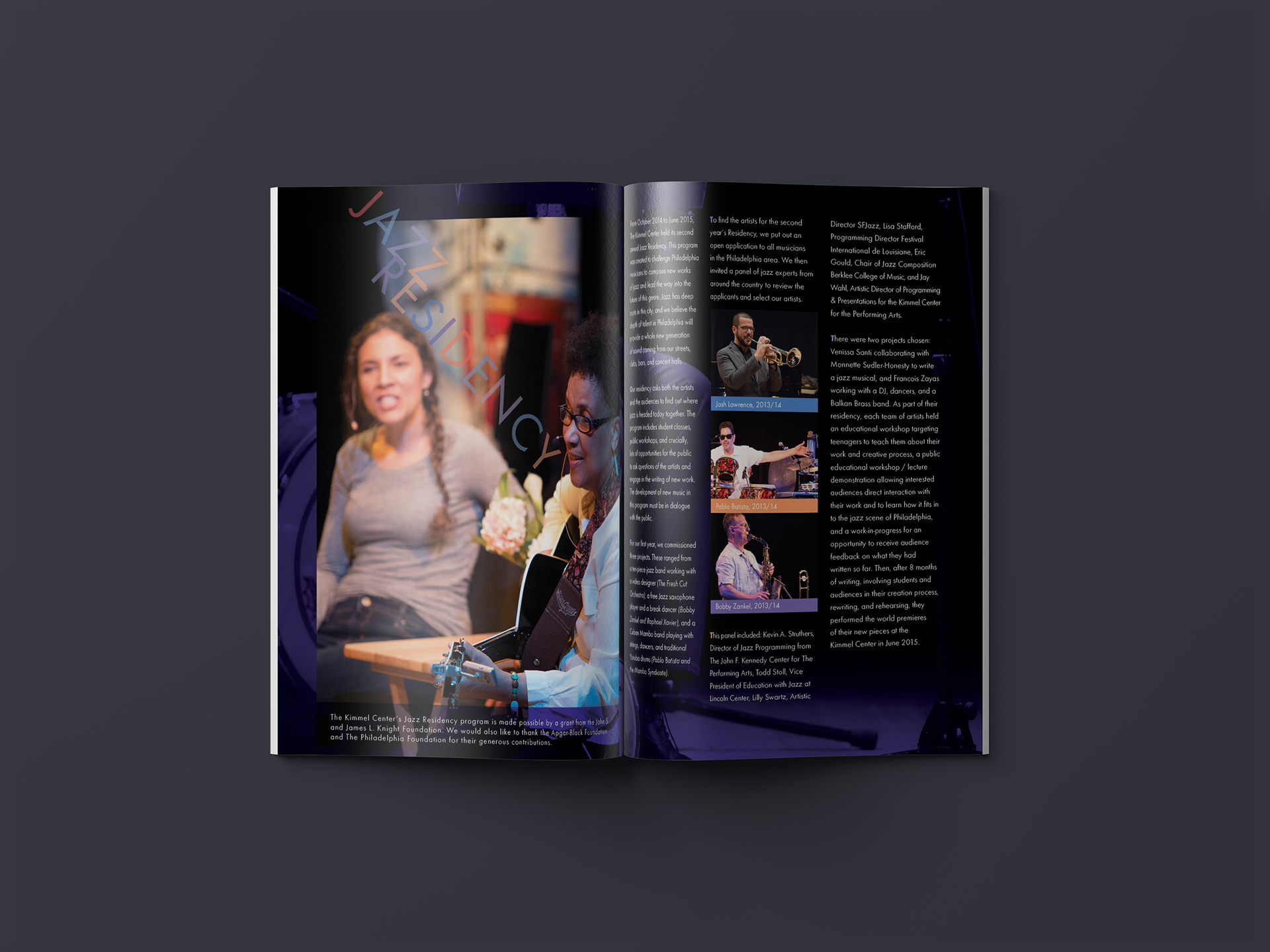
For this, my second year designing the Jazz Residency brochure, the joy and energy in the performers faces just screamed Russian Constructivism and Herbert Matters' photomontage style for the Swiss National Tourist Office. I wanted to give a nod to the design, not copy it. I'm very happy with the results. Bright, exuberant and restrained.